Barndiabetesfonden
A new visual identity for Barndiabetesfonden.
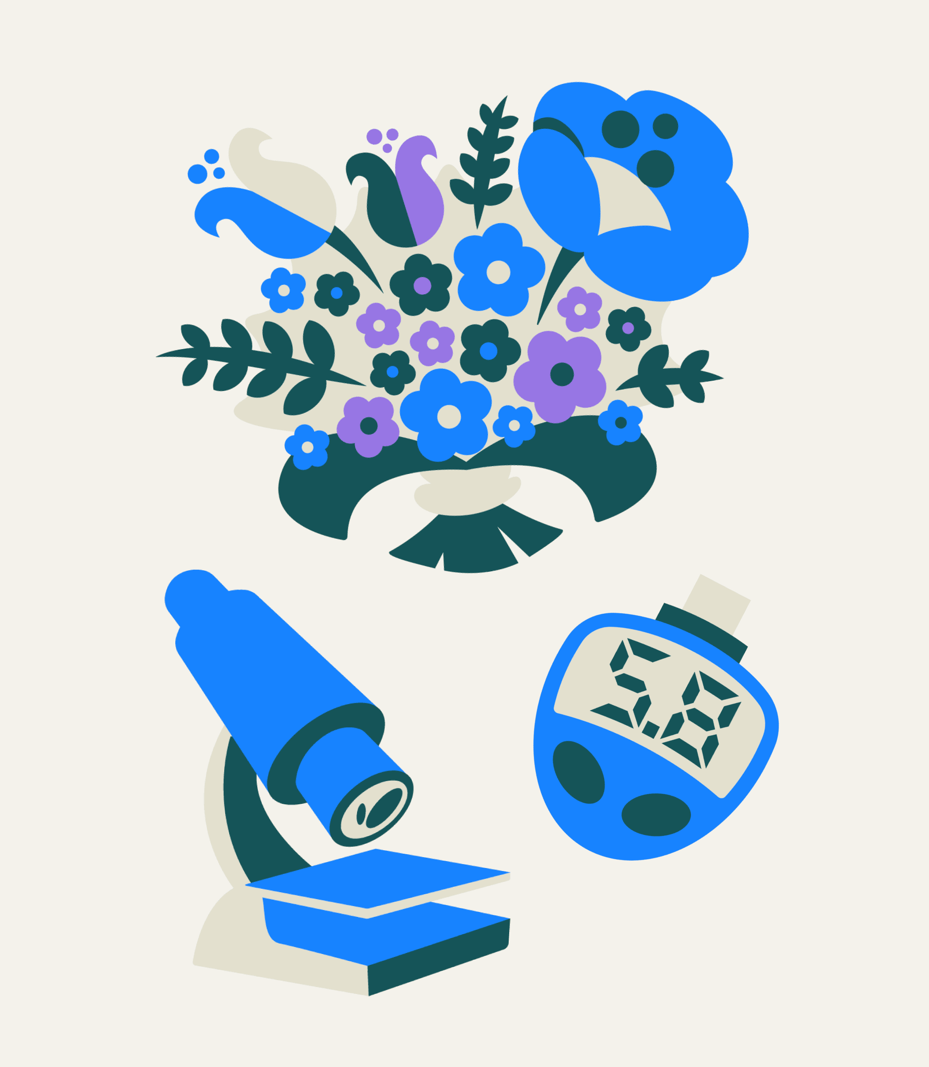
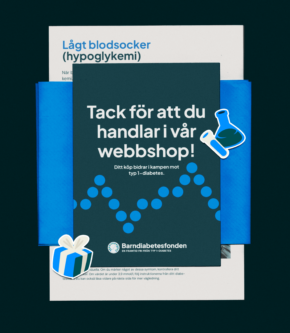
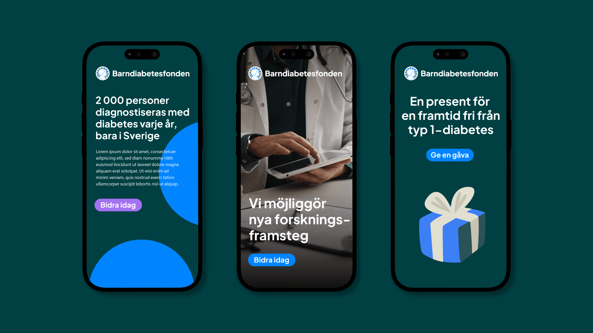
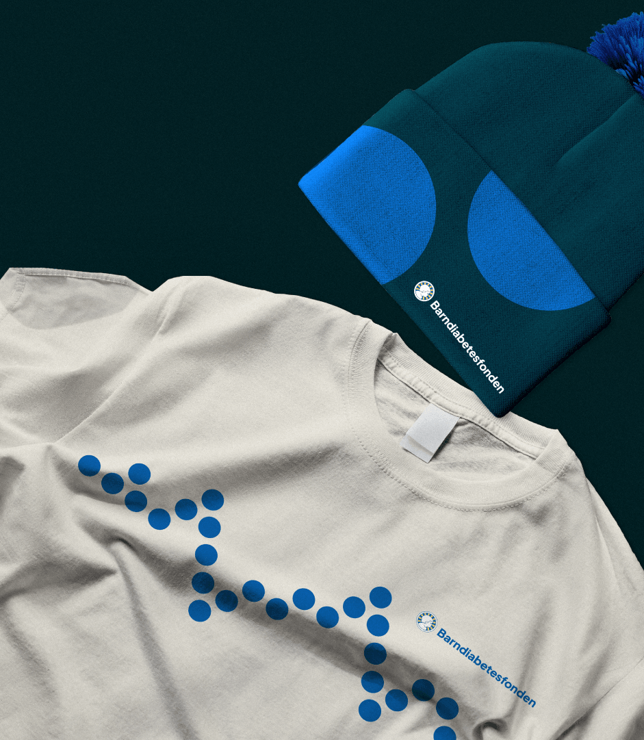
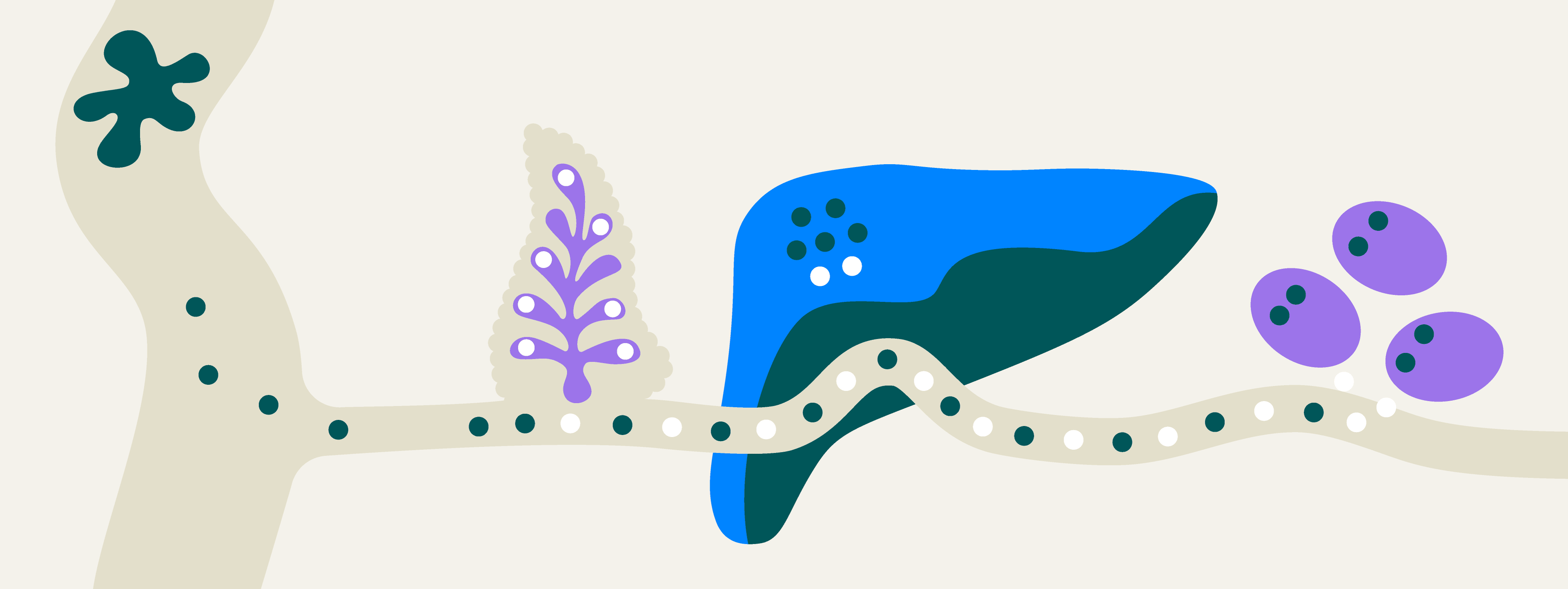
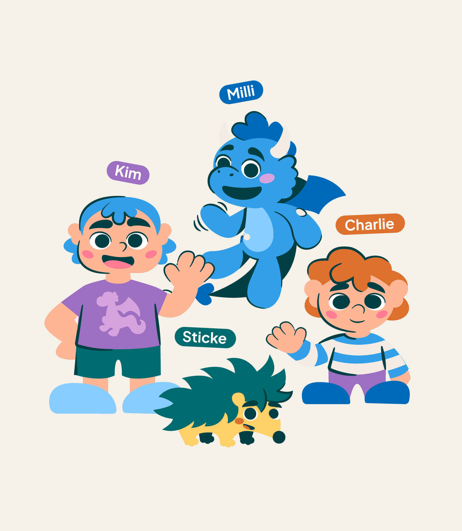
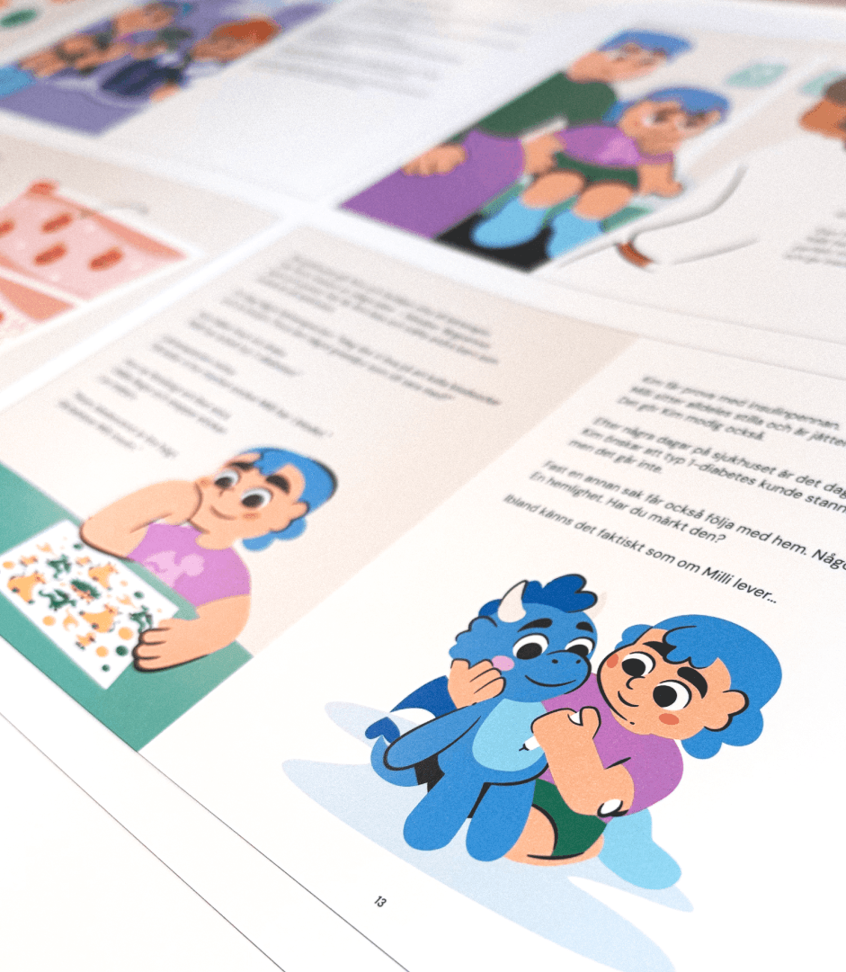
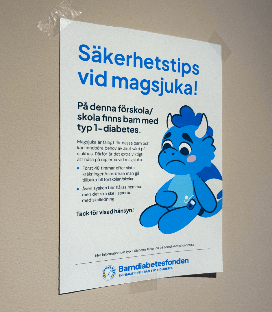
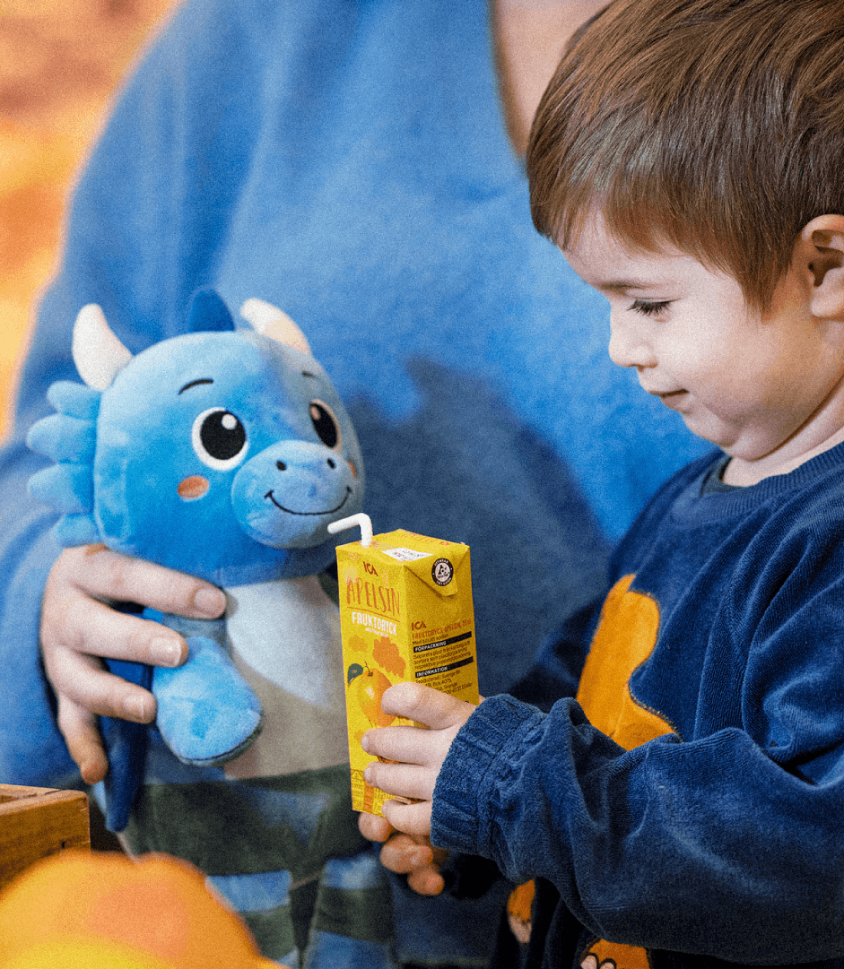
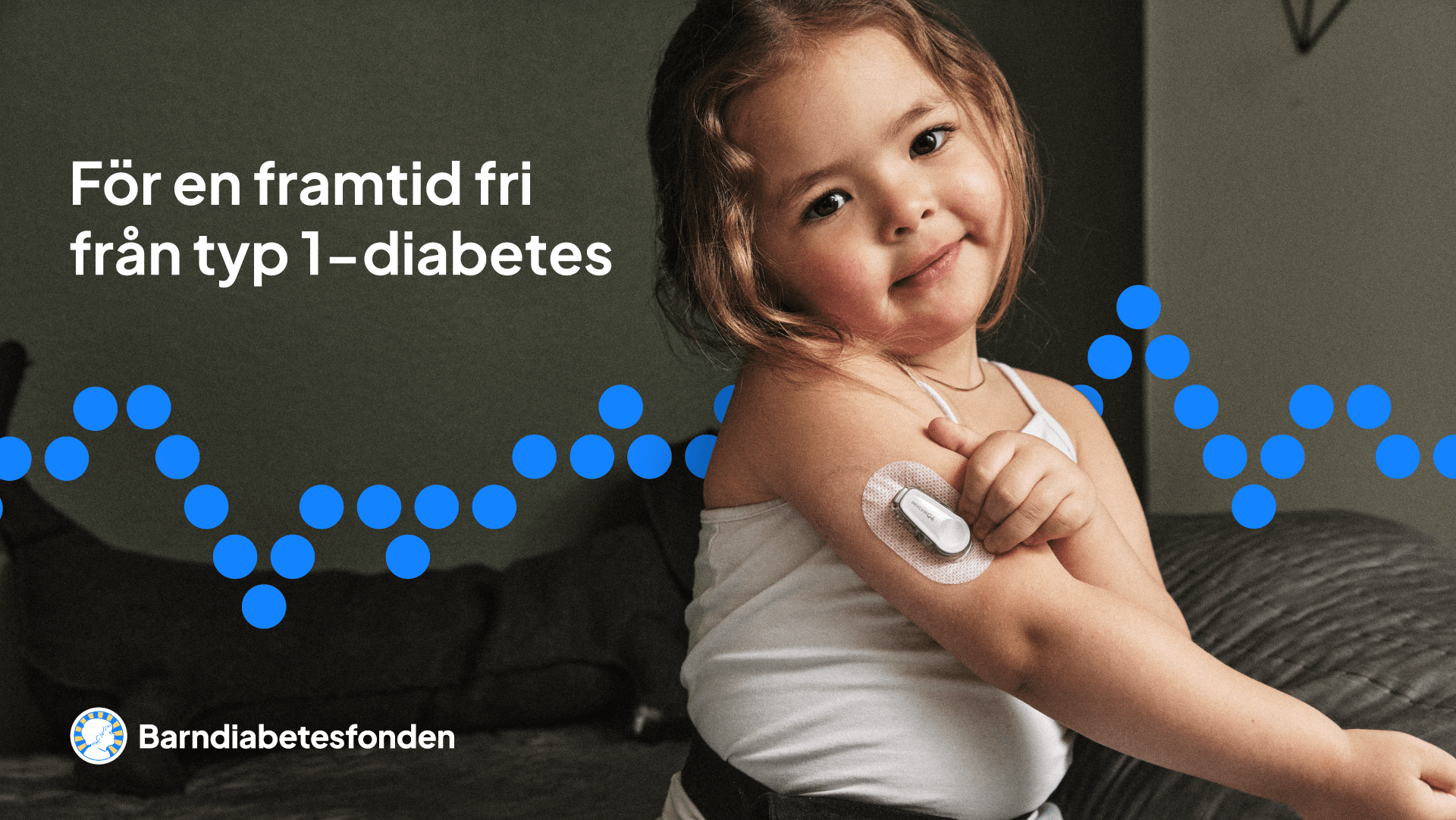
We created a concept that connects science and everyday life in a more human and accessible way. Inspired by the blood glucose curve, the blue curve became the starting point for an identity shaped by the reality of type 1-diabetes - moving between highs and lows, uncertainty and hope.
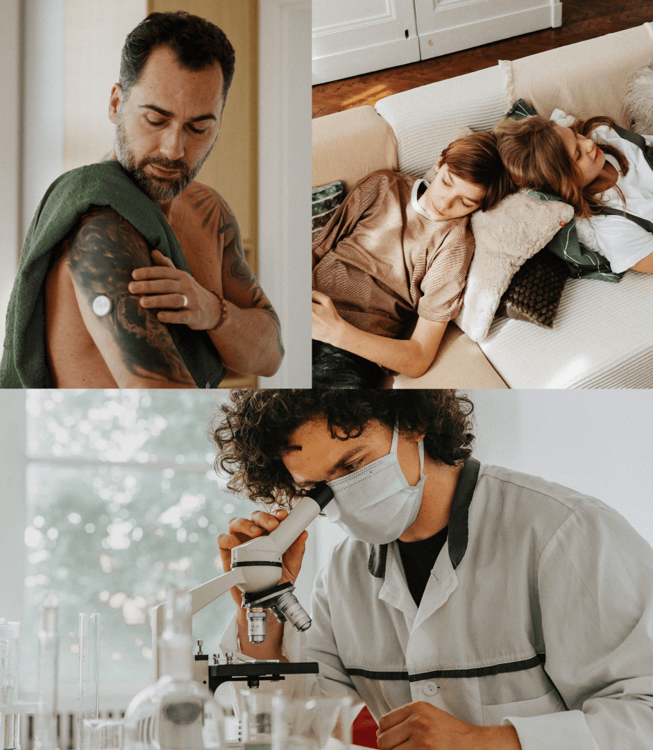
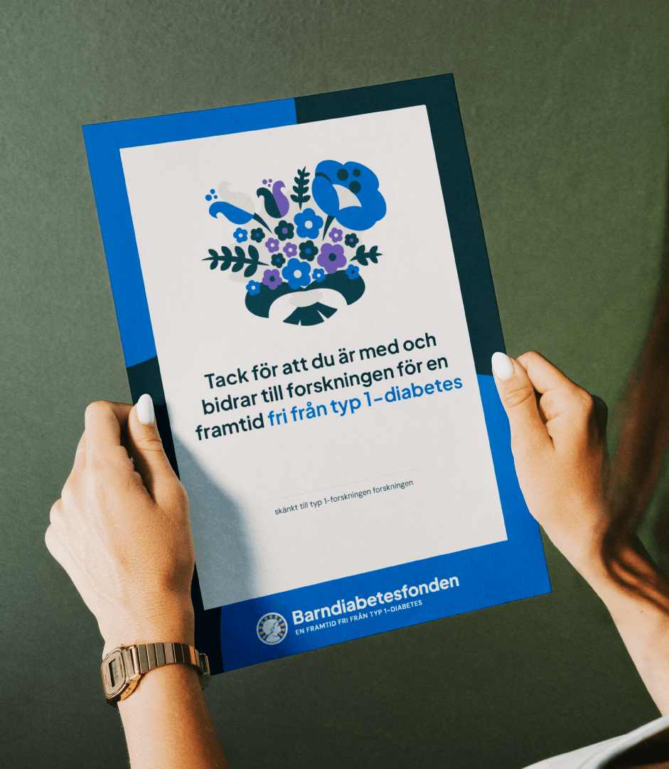
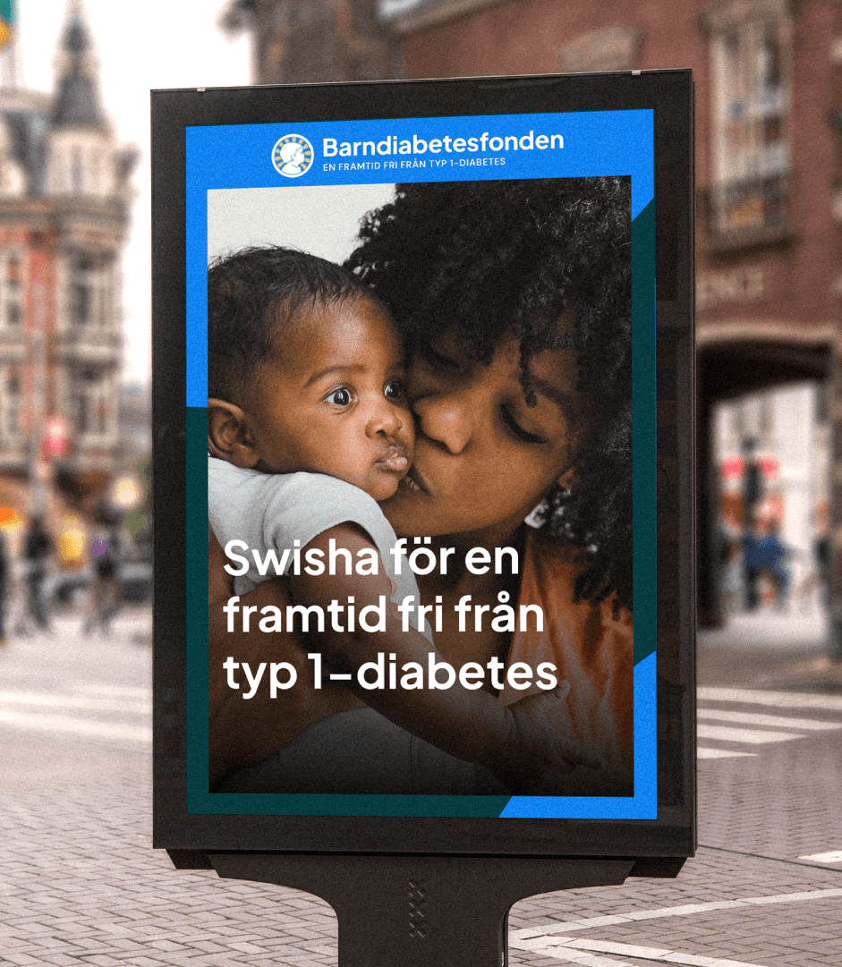
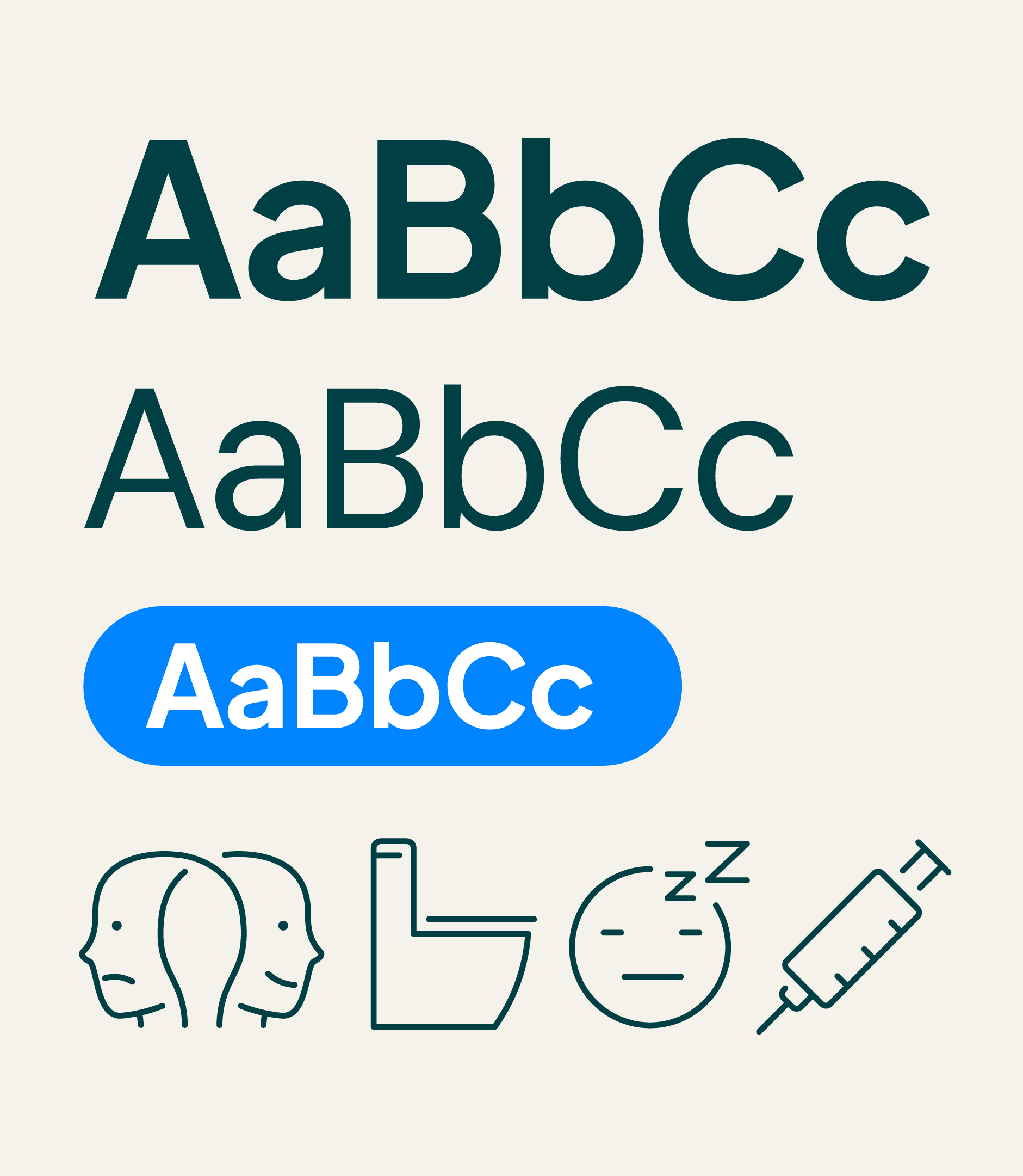
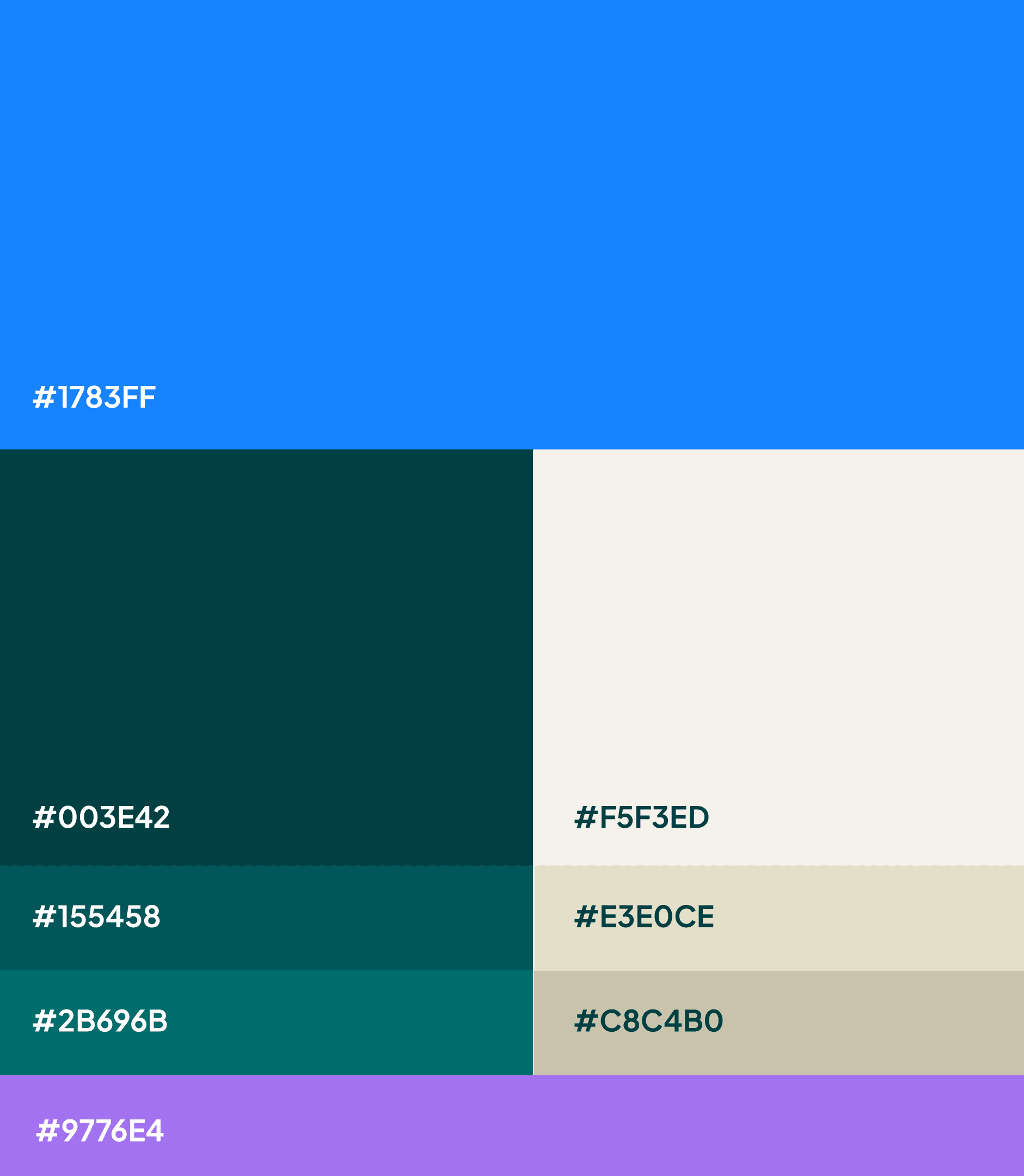
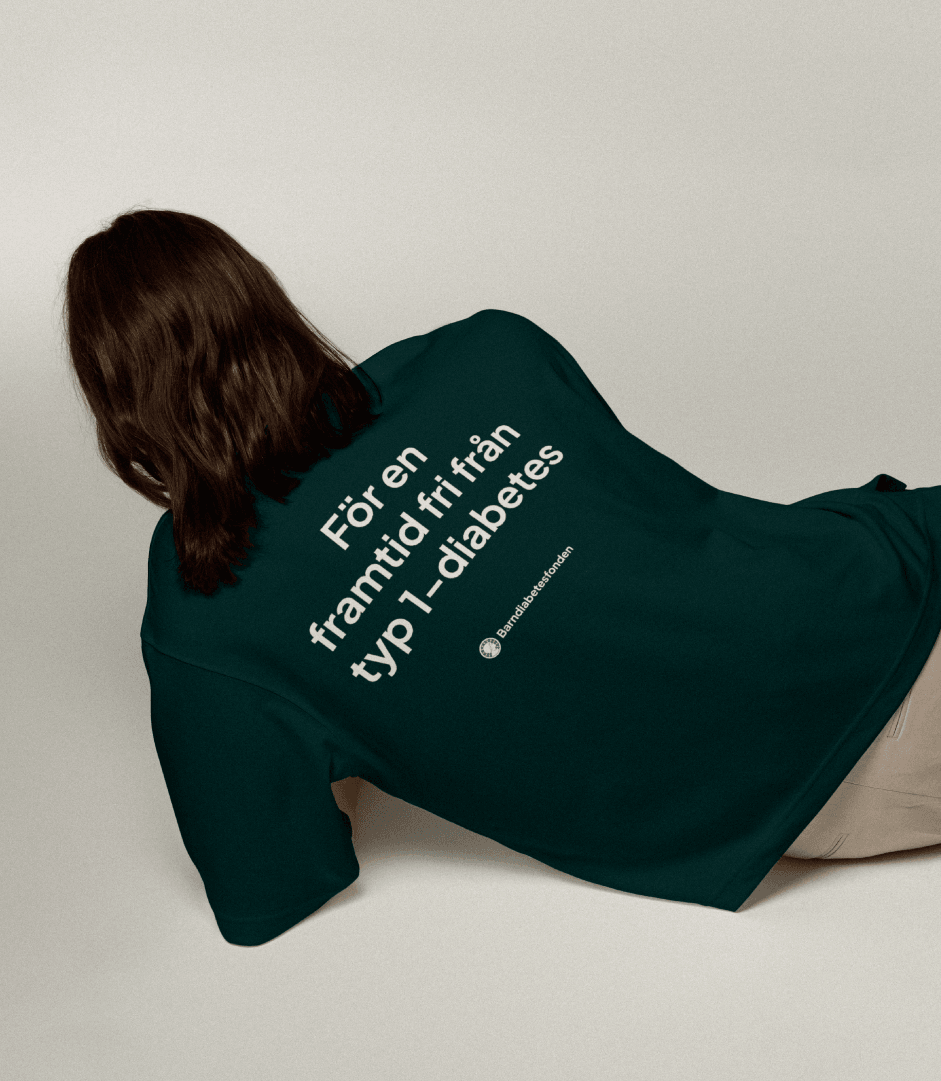
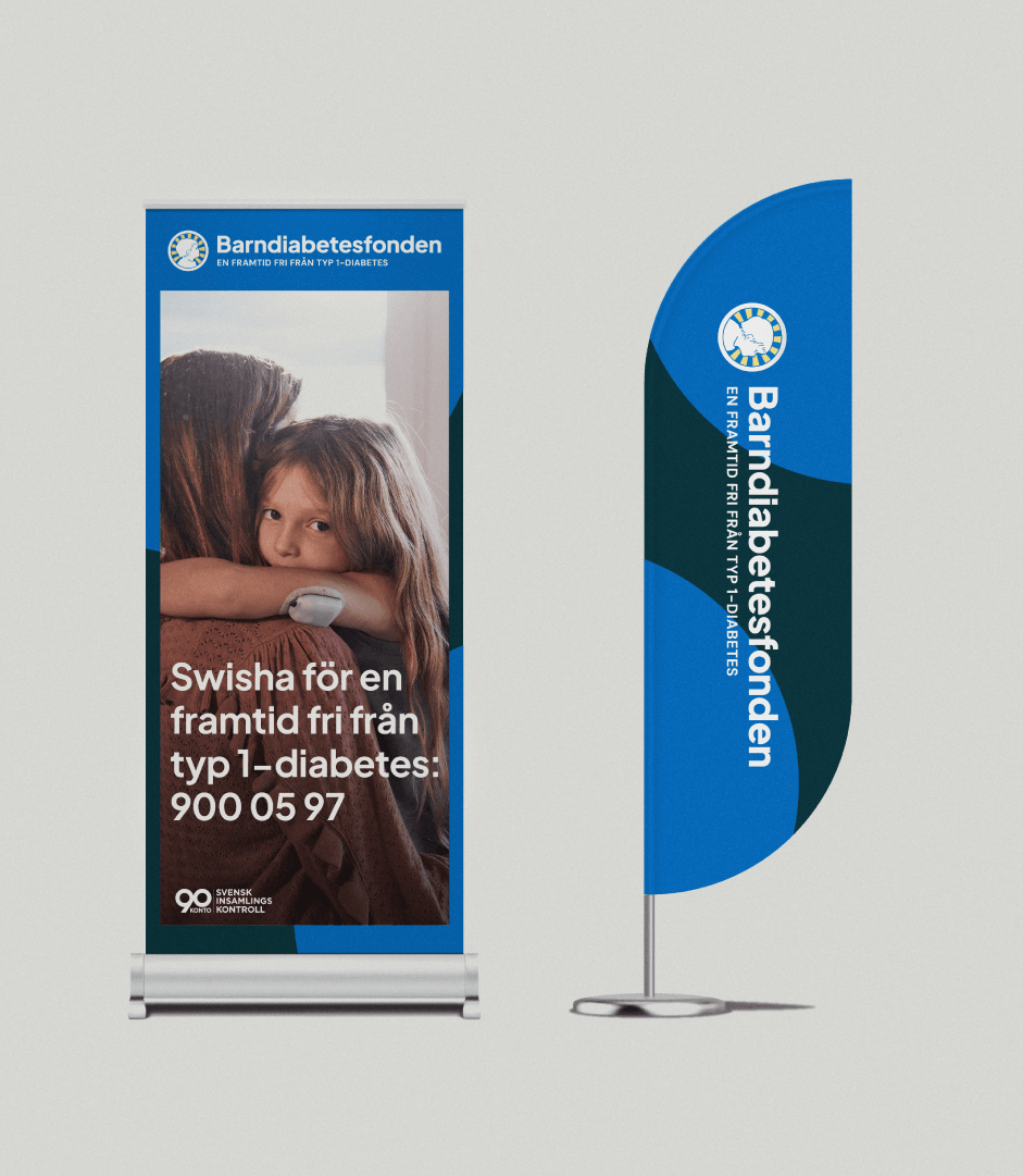
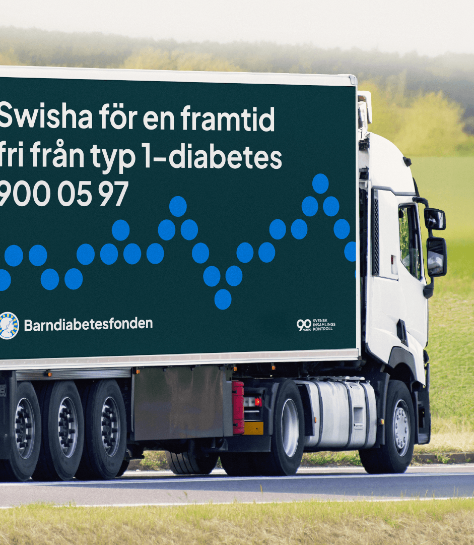
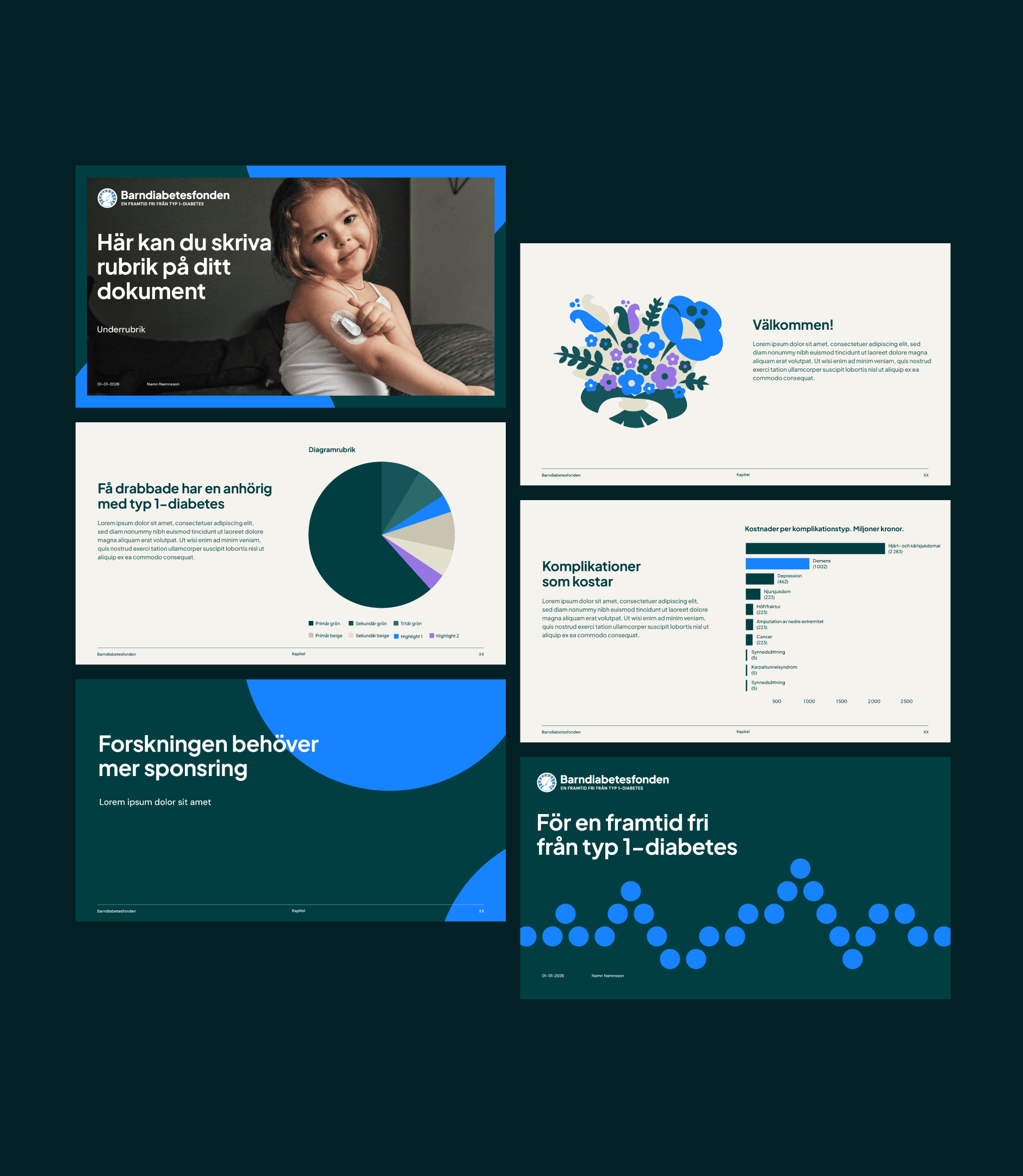
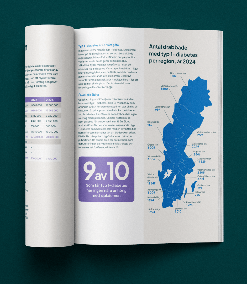
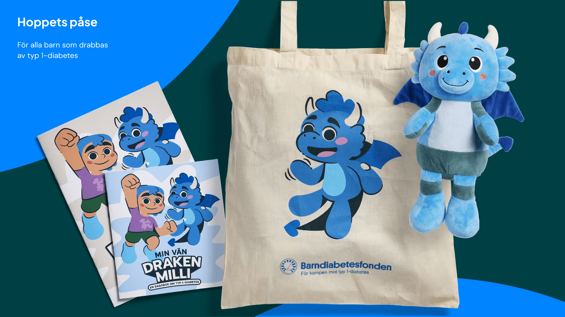
Together, we developed a visual system designed to strengthen recognition, unify communication, and reach broader audiences. With an updated color palette, a world of illustrations, refined logotype, and a more flexible expression, the identity is built to work across the entire organization, from local initiatives to national campaigns. Both the visual language and communication were developed to include a wider audience around type 1-diabetes: children, adults, relatives, and the research community alike.