Felix Brand World
Background
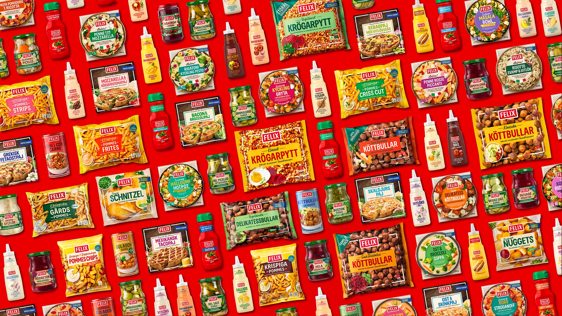
Felix, a cross-category brand with 250+ iconic products. Needed a new visual identity that unites tradition with modern appeal.
Positioning/Strategy
By building a dynamic design system that addresses specific consumer needs across every category, we’ve reinforced the brand’s central promise: Felix – always a little tastier.
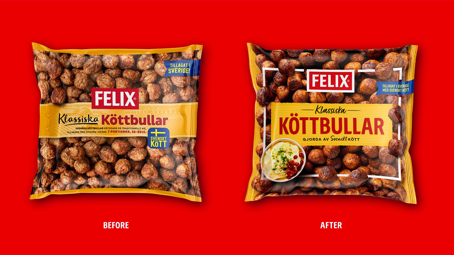
Visual Concept
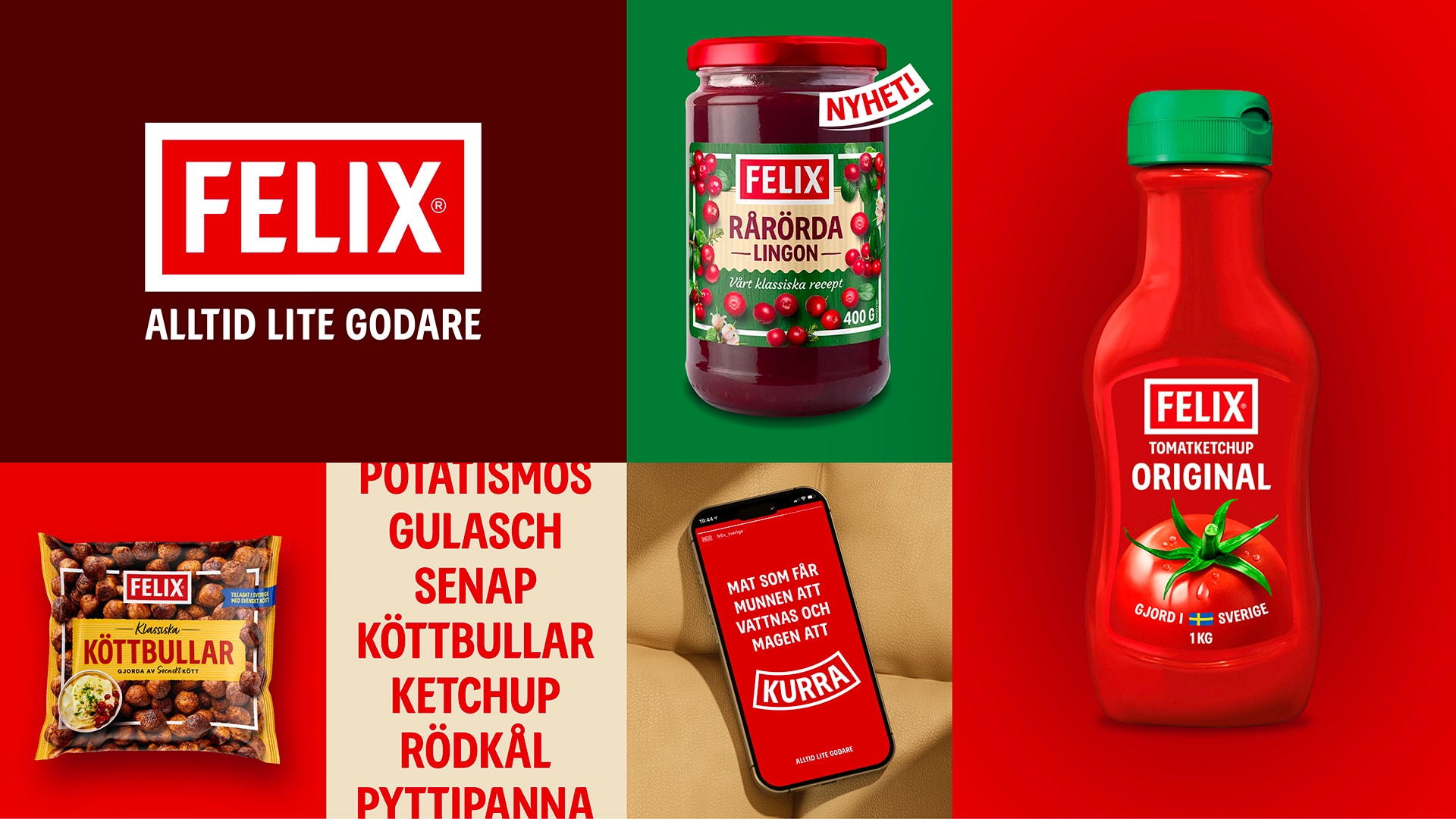
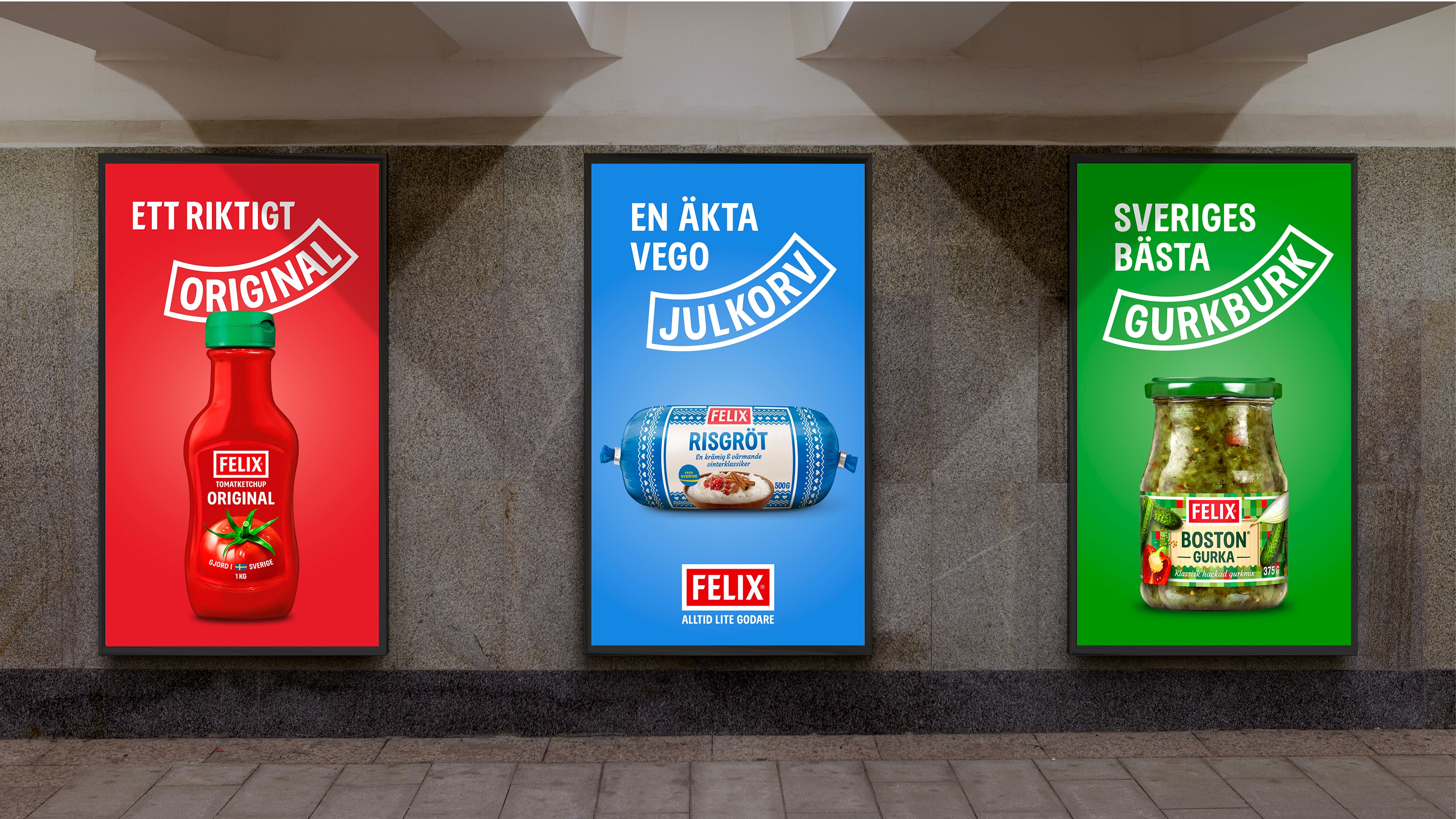
The strategy behind the new identity is rooted in a simplified logo, refined for seamless functionality across both digital and physical environments. To establish a cohesive architecture throughout the extensive range, we developed a system of frames and banners. These elements are derived directly from the logo’s geometry, serving as structural anchors for framing and product naming, ensuring a "red thread" from the freezer aisle to the pantry.
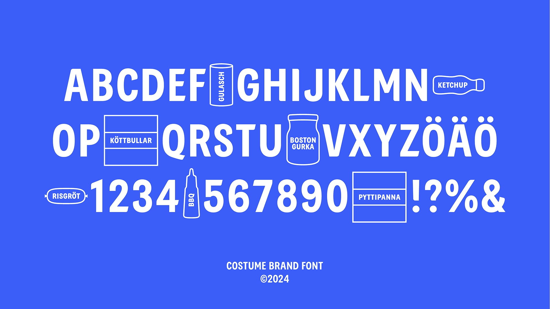
As the name Felix translates to "happiness," in latin it felt natural to integrate a subtle smile into the identity—a visual reminder of the joy that good food brings. This warmth is further reflected in the bespoke typeface, with characters drawn from the unique letterforms of the logo to create a unified typographic language.
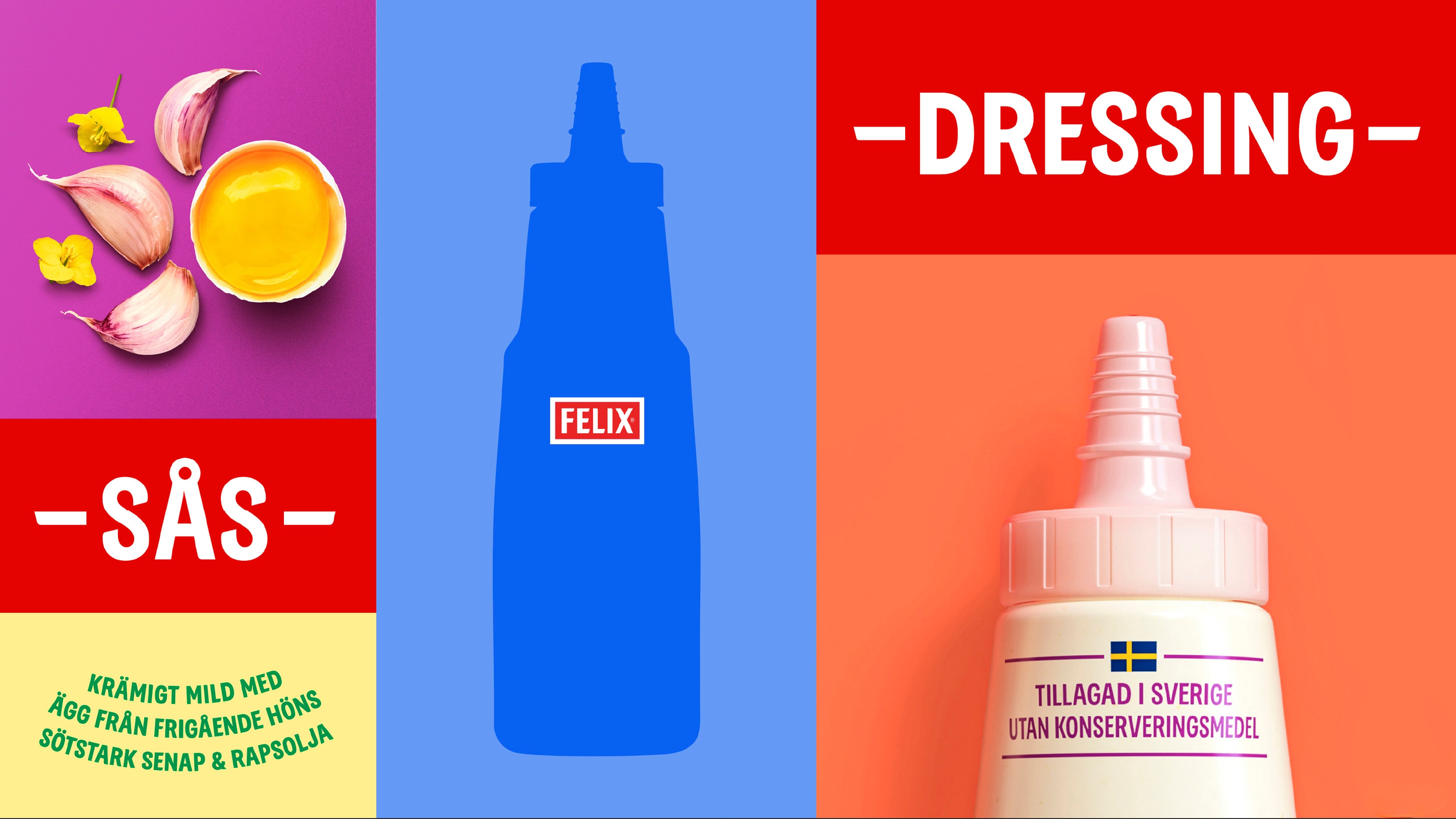
To distinguish the products, we crafted an imagery style saturated with taste. By combining tactile textures with a focus on raw ingredient aesthetics, we communicate that Felix is not just a reliable choice, but one that is true to its word — always a little tastier.